ONE BITE is a healthy cookie brand created as the final project of design studies. It starts from a simple, powerful idea: quick energy to savour every second.
The challenge was to build a complete company from scratch — value proposition, audience, narrative, and visual system — for active people who love the outdoors and want a tasty snack that provides sustained energy without slowing the pace. The brand stands for joy, dynamism, and a spirit of adventure, tying its messages and imagery to the four elements of nature as a metaphor for “ongoing natural energy.”
NAME
We chose the name ONE BITE for two reasons: it conveys that “with a single bite” you get what you need, and ONE also condenses the concept of Ongoing Natural Energy
The brand is built on that idea: enjoying life and nature without interruption. Its universe draws from the four natural energy sources — air, water, earth, and fire — giving depth and meaning to both narrative and identity.
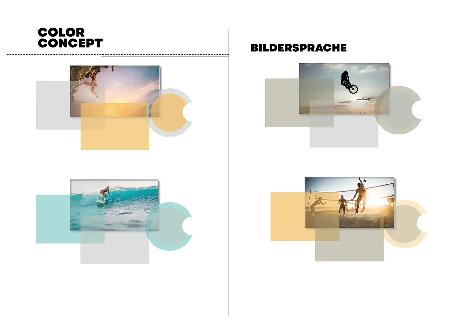
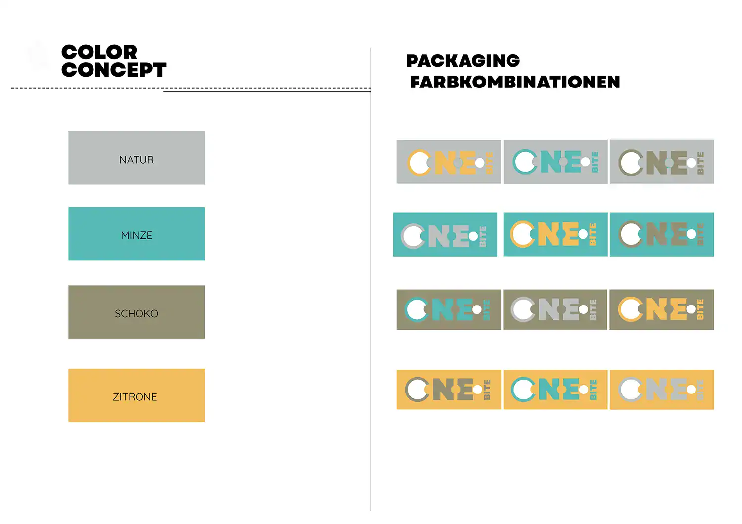
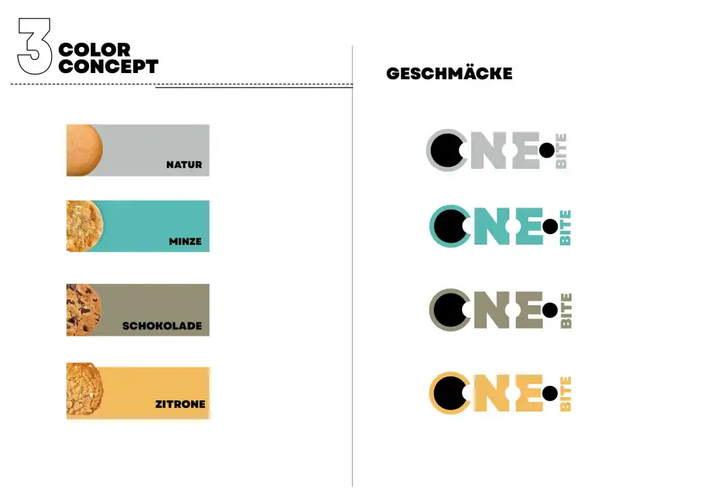
VISUAL LANGUAGE & COLOR SYSTEM
Color translates ONE BITE’s promise — Ongoing Natural Energy — into an immediate experience.
Four color axes — air, water, earth, fire — organize the product families and make each variety instantly recognizable
A lean hierarchy of primary, secondary and accent tones preserves consistency across packaging, web and retail. The result: a memorable, scalable palette that turns natural energy into a clear visual language.
ADVERTISING MATERIALS
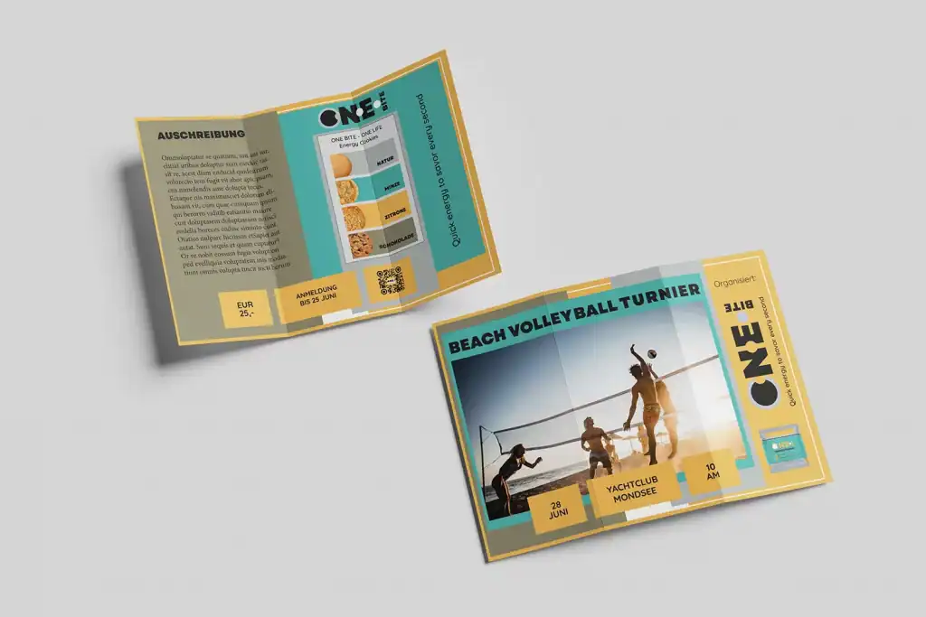
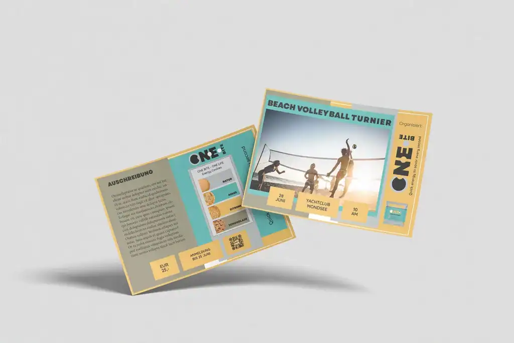
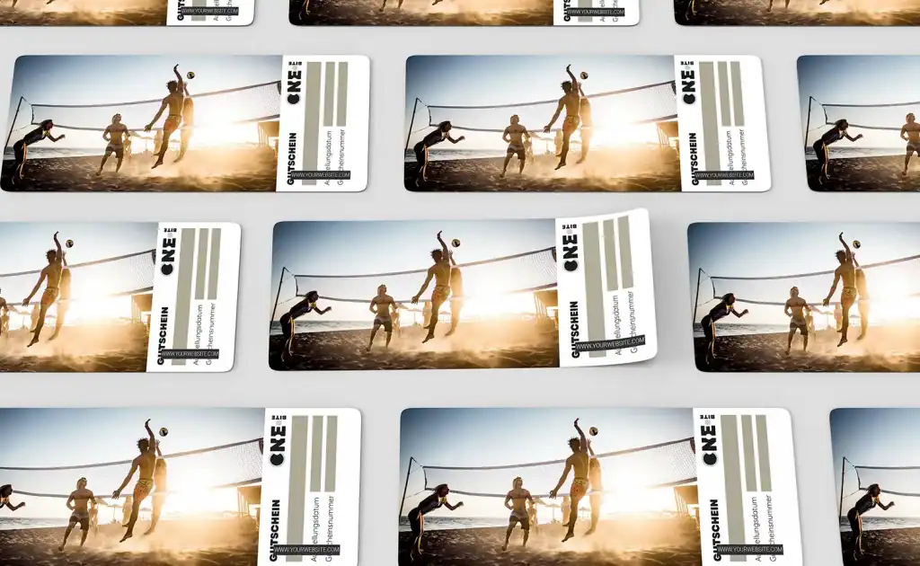
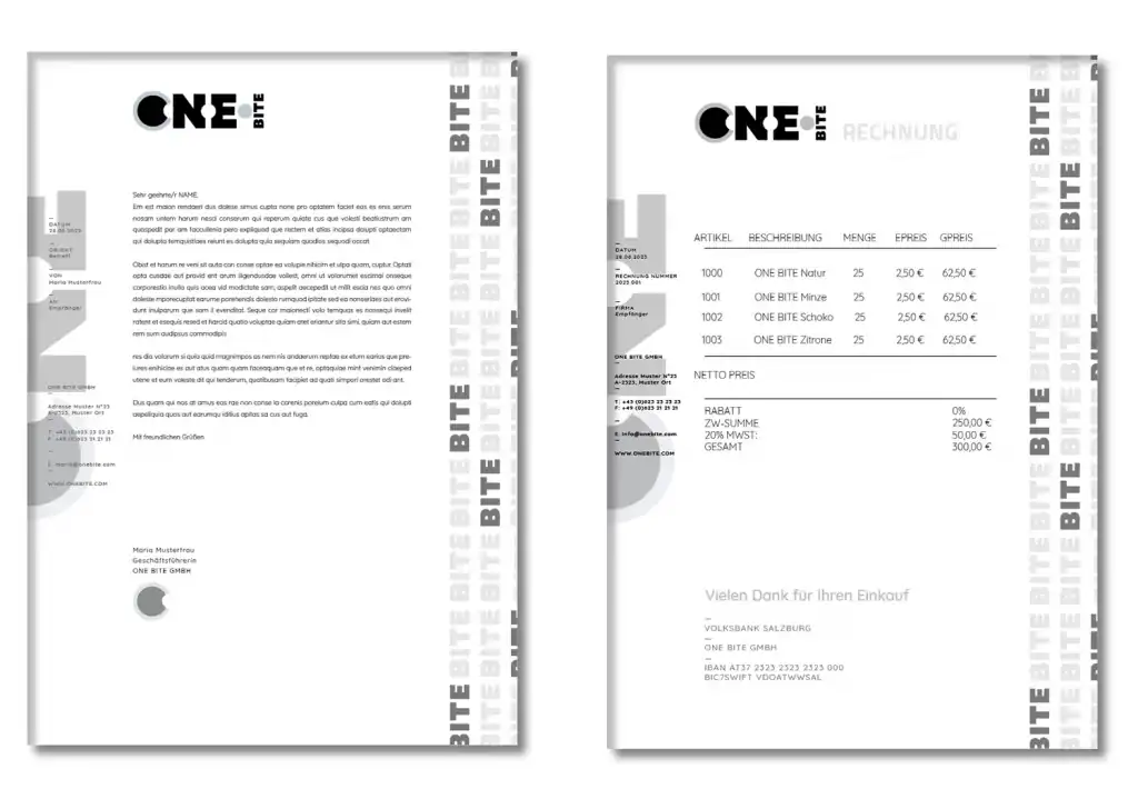
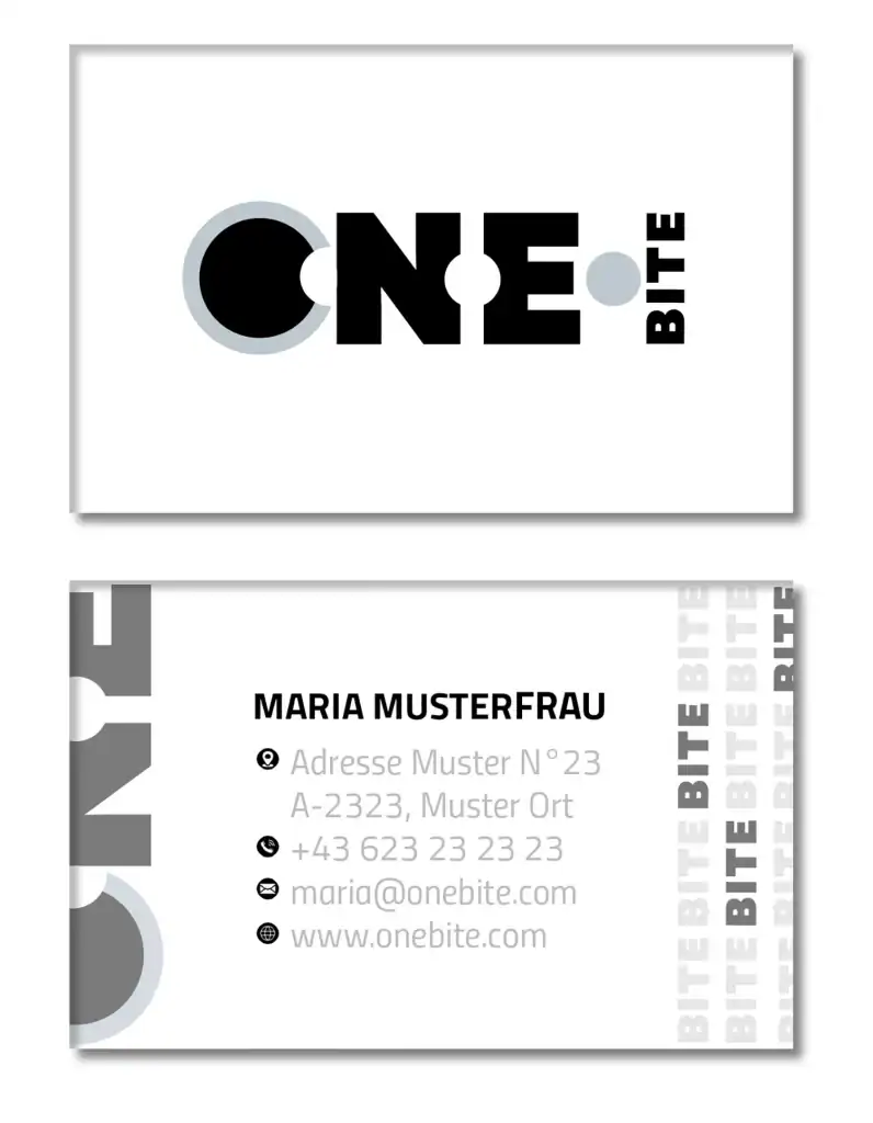
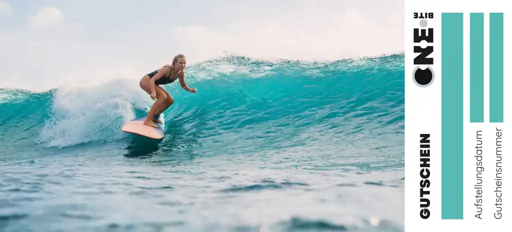
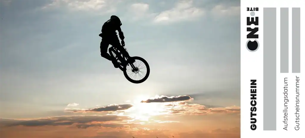
We activate the brand on the street, in-store and online with a coherent, recognizable kit
We designed posters, sampling and promo packs, social graphics and urban formats — all breathing the same energy (color, icons, tone) so the brand is identified at a glance and the message stays clear: natural energy, in one bite.
