ESPAI LABANDÀRIA is more than a tutoring school: it’s a space created by women who believe in learning with care, conscious parenting, and creativity as a driver. A safe, welcoming place where children and families find calm, support, and a genuine love of learning—turning study into a positive, meaningful experience.
At Is Not Personal, we helped bring that essence to life. We built a warm, vibrant brand identity—logo, color palette, visual assets, and voice—that blends education, play, and affection, and truly connects with their community. A recognizable visual world that makes visible what Espai Labandària already is at its core.
logo
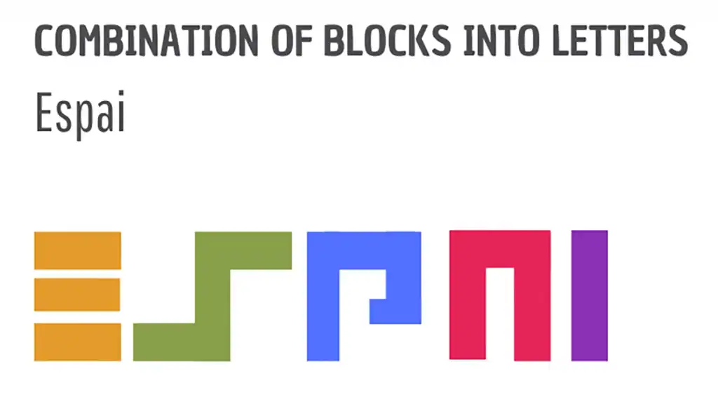
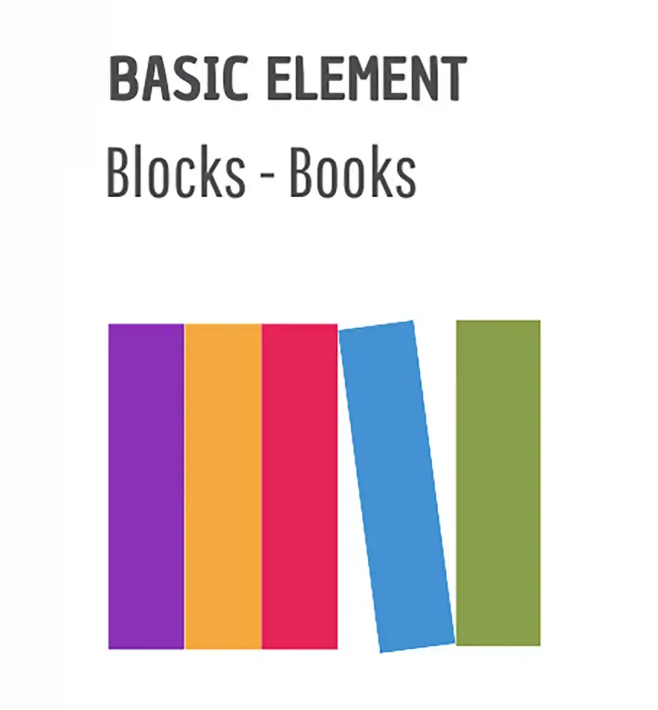
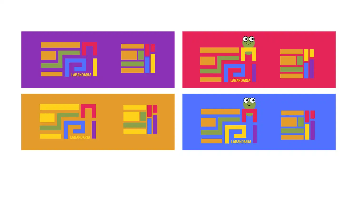
For Espai Labandària we designed a logotype built from learning elements: books.
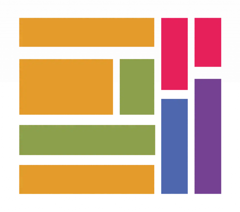
With them we created a modular block system that writes the school’s name and expresses its purpose: helping to fit the pieces together. The shapes combine, align, and expand to generate consistent variants and assets for posters, social media, and classroom materials.
COLORS
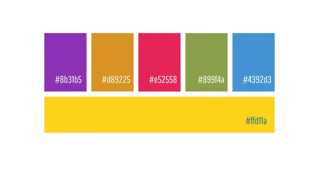
The color palette is key: bright, cheerful tones that make the brand instantly recognizable and reinforce its warm, optimistic character.
The result is a recognizable, dynamic, and playful identity that turns the world of books into a unique visual language.
IMAGES
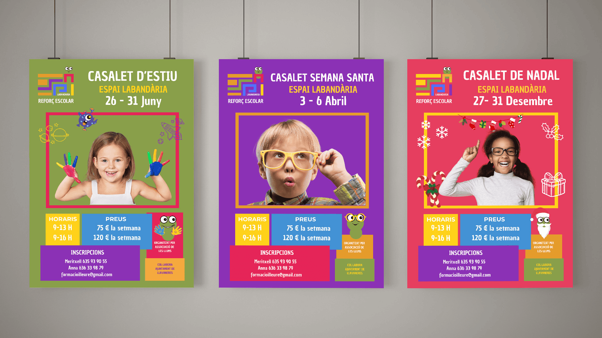
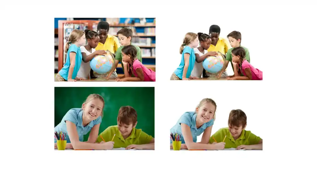
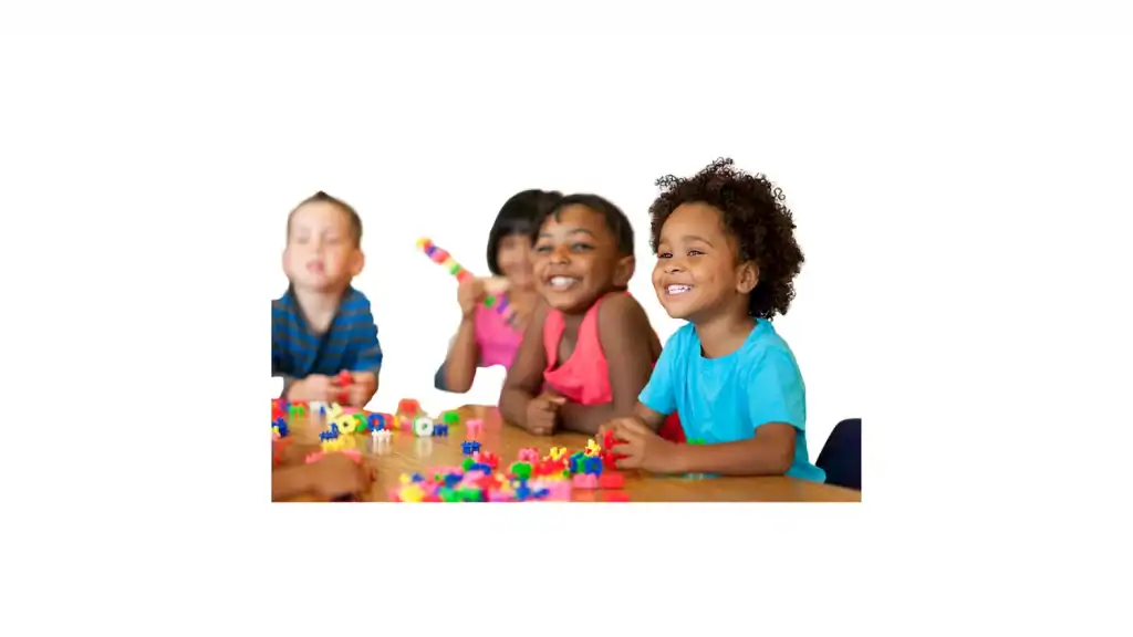
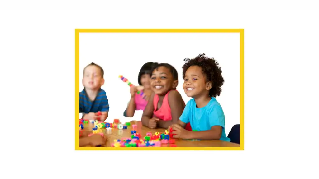
WE WORK WITH BACKGROUND-FREE PHOTOS OF CHILDREN
SO ALL ATTENTION FALLS ON THEM
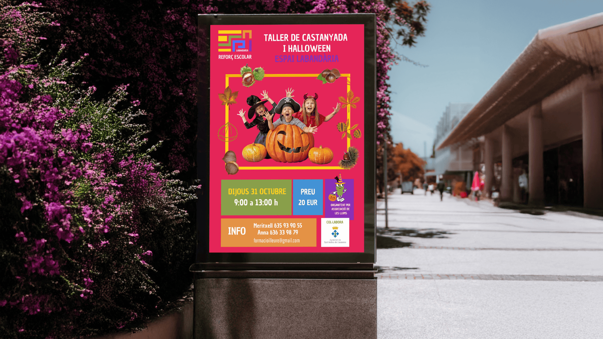
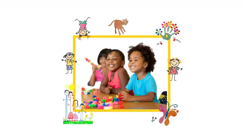
On this clean canvas, we “wrap” them with the window of knowledge—frames and pieces from the block system—that guide the eye to what matters: curiosity, focus, and progress. The result is a warm, clear image where each child is at the center and the visual universe supports without distracting.
STICKERS
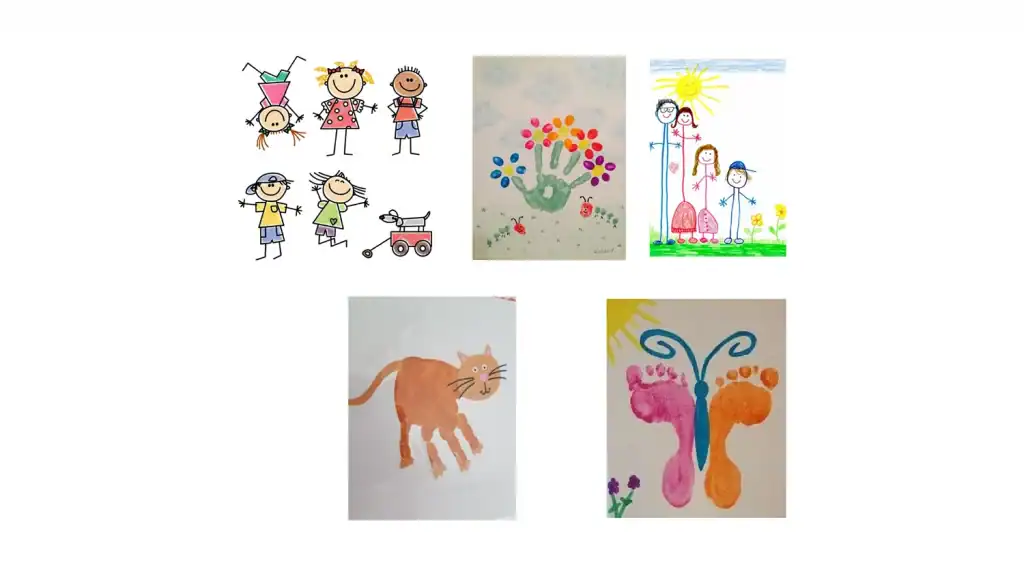
We turn their drawings into stickers to play, interact, and build connection
We select and digitize illustrations made by the children to transform them into school-branded stickers. By using their creativity as brand material, we increase participation, strengthen belonging, and turn every communication piece into a space for play and positive recognition.
MASCOT
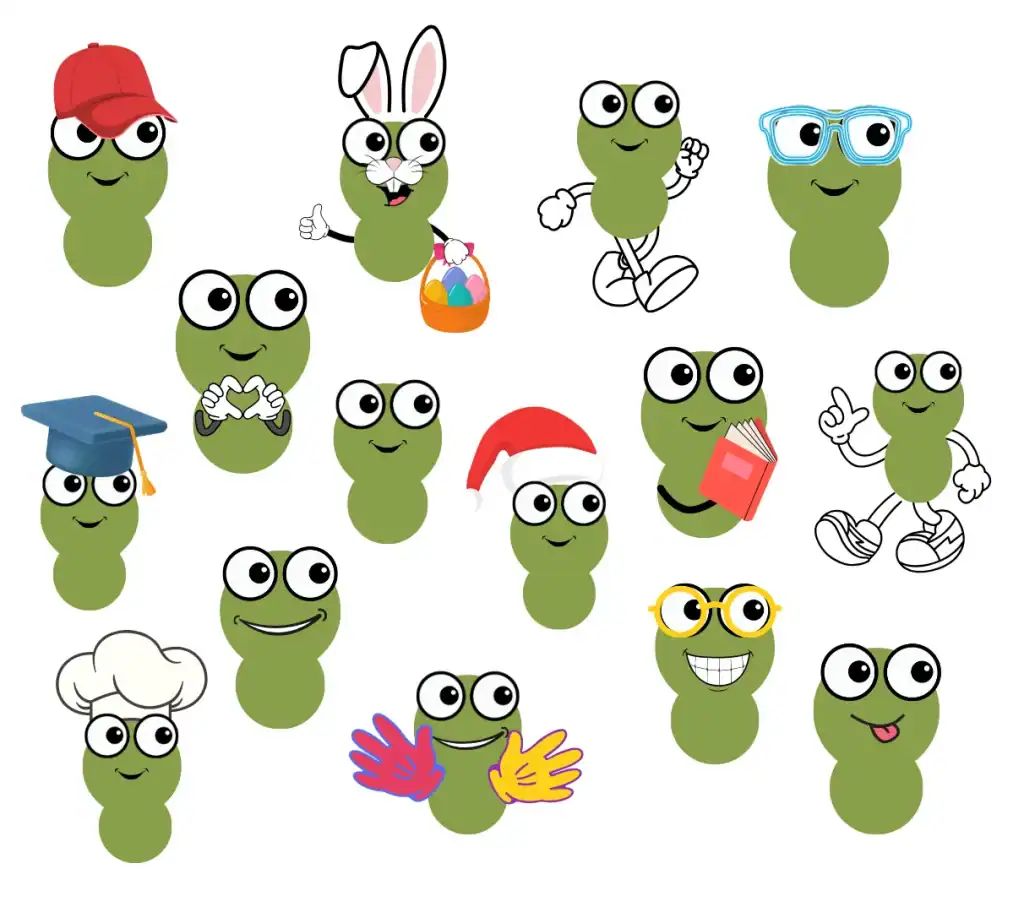
We created a mascot because it adds movement and play, helps children identify with the space, and reinforces the bond with the town
We developed a pea-shaped mascot to add warmth, humor, and local roots. This emblem—linked to the municipality’s tradition—structures signage, learning materials, stickers, and digital communication, bringing visual coherence and a more friendly, memorable experience for students and families.
DESIGN ELEMENTS
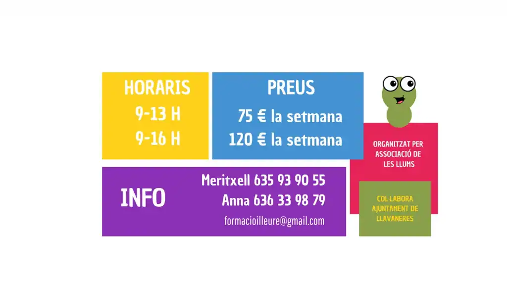
We created a modular system of color blocks to highlight key information (schedules, prices, contact, partners)
They always appear in the same place and with the same typographic hierarchy, so every time someone sees a poster they can find the important information in seconds. The result: quick reading, clear order, and a friendly aesthetic that integrates the rest of the graphic elements.
