STILL & STRONG emerges from a transformation in progress: Two yoga teachers turn their years-long search for the essence of yoga into a shared project – a practice that unites opposites and makes yoga accessible to everyone.
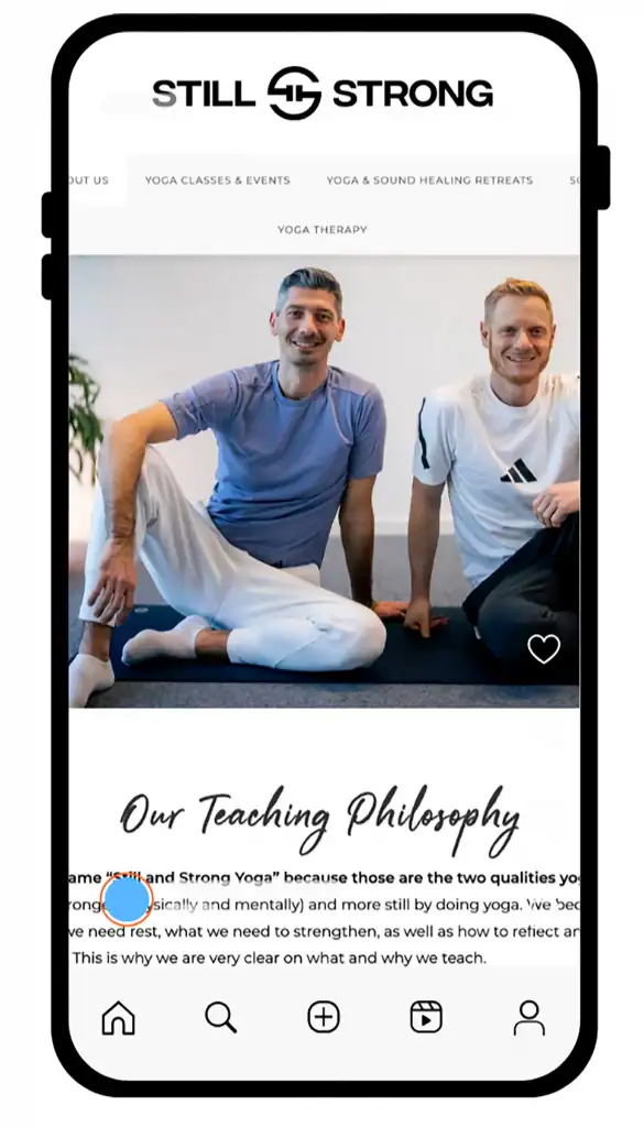
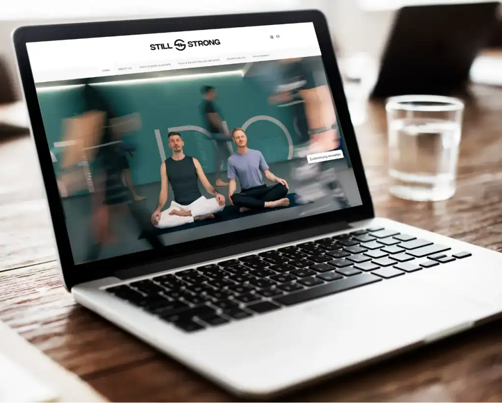
We accompanied Still & Strong at the beginning of this journey: From sharpening the business concept through strategic positioning to developing an independent brand identity. The result is a visual and communicative system that reflects the duality of their philosophy – logo, typography, color concept, and tonality that project their community-oriented approach. The brand and website mark the beginning of their new path. A transformation that continues.
logo
A minimal mark that unites opposites.
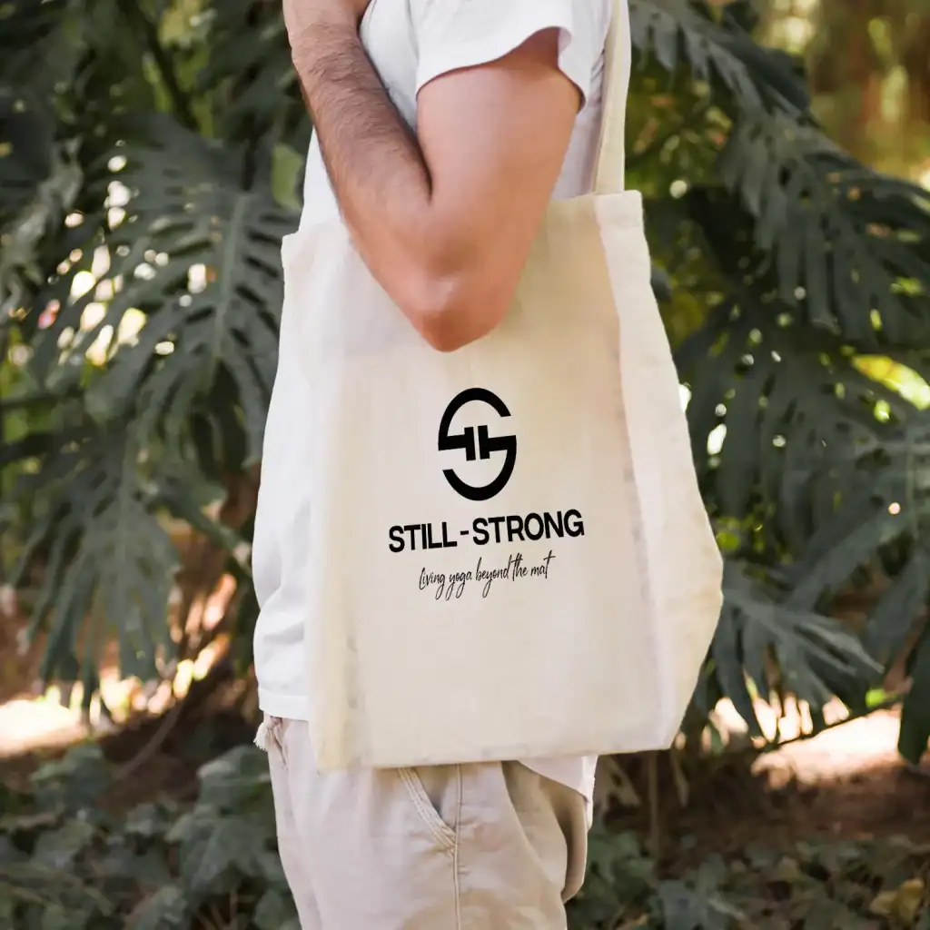
An ampersand that also forms two “S”. The continuous line fuses Still & Strong into a single gesture:
connection, balance, and sustained practice. It works as a standalone seal across web, print, and social; scales reliably in monochrome and remains legible at very small sizes.



WEBSITE
